
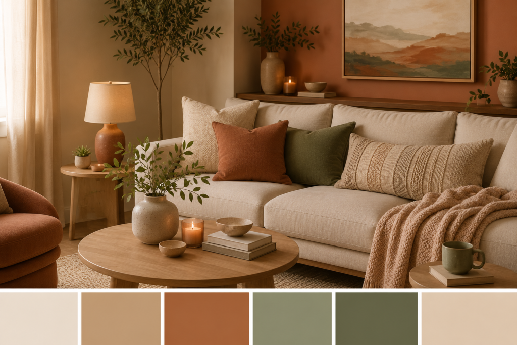
The right color palette can completely change the way your home feels.
Warm neutrals can make a room feel calm and welcoming. Earthy greens can bring a natural, relaxed atmosphere. Soft terracotta can add personality, while deep brown and charcoal can create a sense of sophistication.
But choosing colors for your home isn’t always easy.
You might love a color in the store but find that it looks completely different on your wall. Or you may have beautiful furniture but struggle to make everything work together.
That’s why we’ve created this guide to cozy home color palettes.
You’ll discover 15 carefully balanced color combinations, how to use them throughout your home, which colors work best together, and simple ways to introduce each palette without completely redecorating.
Whether you’re decorating a small apartment, refreshing your living room, or creating a warmer bedroom, these ideas will help you build a home that feels comfortable, cohesive, and beautifully put together.
How to Choose a Cozy Color Palette
Before choosing specific colors, it helps to understand how a successful palette works.
A simple interior color scheme usually contains three levels:
1. Dominant Color
This is the main color of the room and usually covers the largest area.
Examples:
- Walls
- Large furniture
- Flooring
- Curtains
2. Secondary Color
This supports the dominant color and adds depth.
Examples:
- Rugs
- Sofas
- Accent chairs
- Bedding
3. Accent Color
This is where you introduce personality.
Examples:
- Cushions
- Artwork
- Vases
- Lamps
- Decorative objects
A useful starting point is the 60-30-10 rule:
60% dominant color + 30% secondary color + 10% accent color
You don’t have to follow these percentages exactly. Think of them as a simple guide for creating balance.
1. Warm White + Beige + Natural Wood
If you’re looking for a timeless cozy palette, start here.
Warm white keeps the room bright while beige adds softness. Natural wood introduces texture and warmth.
Best for:
- Living rooms
- Bedrooms
- Small apartments
- Scandinavian-inspired interiors
How to use it:
60%: Warm white walls
30%: Beige furniture and textiles
10%: Natural wood and darker accents
Add a cream rug, linen cushions, and light-wood furniture to complete the look.
2. Cream + Camel + Soft Brown
This palette is perfect if you want a sophisticated but comfortable interior.
Cream provides a light foundation while camel and brown add richness.
Try:
- Cream walls
- Camel-colored sofa
- Darker brown cushions
- Natural wood furniture
- Brass lighting
The result feels warm without becoming too dark.
3. Beige + Sage Green + Cream
Sage green is one of the easiest accent colors to use when you want a natural atmosphere.
Combined with beige and cream, it creates a relaxed palette inspired by nature.
Best for:
- Living rooms
- Bedrooms
- Home offices
- Entryways
Easy way to introduce sage:
Start with cushions, plants, artwork, or a small accent chair instead of painting the entire room.
4. Terracotta + Cream + Natural Wood
If neutral interiors feel too plain for you, add terracotta.
This earthy orange-brown shade brings warmth and personality while still feeling natural.
Use terracotta in:
- Cushions
- Ceramic vases
- Artwork
- Rugs
- Throws
Keep the larger surfaces cream or beige so the terracotta remains an accent rather than overwhelming the room.
5. Warm Gray + Cream + Charcoal
Gray doesn’t have to feel cold.
Choose a warm gray with beige or brown undertones and pair it with cream and charcoal.
This creates a modern, sophisticated look.
Best for:
- Contemporary apartments
- Living rooms
- Home offices
- Minimalist interiors
Use charcoal sparingly through lamps, frames, furniture legs, or decorative objects.
6. Olive Green + Beige + Warm White
Olive green creates a deeper, more sophisticated version of the natural palette.
It works particularly well with warm wood and woven textures.
Try:
- Warm white walls
- Beige sofa
- Olive green cushions
- Wooden coffee table
- Woven basket
Add plants to reinforce the connection with nature.
7. Dusty Blue + Cream + Light Wood
If you prefer cooler colors but still want a cozy atmosphere, dusty blue is an excellent choice.
Unlike bright blue, dusty blue feels soft and relaxed.
Best for:
- Bedrooms
- Bathrooms
- Coastal-inspired homes
- Relaxing living spaces
Combine it with cream rather than bright white to keep the overall look warm.
8. Chocolate Brown + Cream + Caramel
Deep brown is making a strong comeback in warm contemporary interiors.
Chocolate brown creates depth and sophistication, while cream prevents the palette from feeling too heavy.
Caramel adds another layer of warmth.
Use brown for:
- Accent chairs
- Curtains
- Cushions
- Wood furniture
- Decorative objects
For smaller rooms, keep the walls light and use chocolate brown mainly as an accent.
9. Blush Beige + Cream + Terracotta
For a softer, more feminine palette, combine blush beige with cream and muted terracotta.
This works particularly well in bedrooms and cozy reading corners.
The colors are warm without becoming overly pink.
Style it with:
- Linen bedding
- Wooden furniture
- Cream curtains
- Terracotta ceramics
- Soft lighting
10. Greige + Cream + Black
Greige is a combination of gray and beige.
It is one of the most versatile neutral colors because it can work with both warm and cool elements.
Add small touches of black to create contrast.
Example:
Greige walls + cream sofa + light wood + black lamp
The black accents give the neutral palette definition without making the room feel harsh.
11. Rust + Sand + Warm White
Rust is a richer alternative to traditional terracotta.
It works especially well during autumn but can be used throughout the year when balanced with neutral colors.
Try it with:
- Sand-colored sofa
- Warm white walls
- Rust cushions
- Natural wood
- Woven accessories
This combination creates a relaxed, earthy atmosphere.
12. Forest Green + Cream + Walnut
For a more dramatic cozy look, consider forest green.
Pair it with cream and rich walnut wood for a sophisticated interior.
Best for:
- Reading rooms
- Dining rooms
- Bedrooms
- Feature walls
Because forest green is intense, use it strategically rather than covering every surface.
A single accent wall can be enough.
13. Warm White + Taupe + Black
This is an excellent choice if you love minimalist interiors but don’t want them to feel cold.
Warm white provides brightness, taupe adds softness, and black creates contrast.
Use black for:
- Lighting
- Picture frames
- Hardware
- Furniture legs
- Small decorative pieces
The result is clean, elegant, and timeless.
14. Caramel + Cream + Olive
Caramel creates warmth while olive green adds an organic touch.
This palette works beautifully with natural materials.
Add:
- Rattan
- Linen
- Light wood
- Ceramic accessories
- Green plants
This is a particularly good palette for creating a relaxed, earthy living room.
15. Monochromatic Beige
If you prefer a very calm interior, try using several shades of beige rather than combining many colors.
The secret is to vary texture and tone.
Combine:
- Cream
- Sand
- Beige
- Taupe
- Light brown
Then add texture through linen, wool, wood, ceramics, and woven materials.
This prevents a monochromatic room from looking flat.
How to Apply a Cozy Color Palette Step by Step
Choosing colors is only half the process.
Here’s how to actually apply your palette to a room.
Step 1: Start With the Largest Surface
Choose your wall or flooring color first.
This becomes the foundation of the room.
Step 2: Choose Your Main Furniture
Your sofa, bed, dining table, or other large pieces should work with your dominant color.
Step 3: Add Your Secondary Color
Introduce it through:
- Rugs
- Curtains
- Bedding
- Accent chairs
- Cushions
Step 4: Add Your Accent Color
Keep accent colors relatively limited.
Use them in small decorative pieces, artwork, lamps, and accessories.
Step 5: Introduce Natural Materials
Wood, linen, wool, rattan, stone, and ceramics can make even a simple color palette feel much richer.
Step 6: Check the Lighting
Colors can look dramatically different under different lighting.
Check your palette during:
- Morning
- Afternoon
- Evening
This is particularly important before painting an entire room.
How to Make Neutral Colors Feel Cozy
Neutral doesn’t have to mean boring.
The key is layering.
Instead of using one beige everywhere, combine several shades and textures.
For example:
Cream wall
Beige sofa
Taupe rug
Light wood table
Brown cushions
Warm lighting
The colors remain subtle, but the different textures create depth.
The Best Cozy Colors for Each Room
| Room | Recommended Colors |
|---|---|
| Living Room | Beige, cream, sage, caramel |
| Bedroom | Cream, dusty blue, taupe, blush beige |
| Kitchen | Warm white, olive, natural wood |
| Bathroom | Warm white, beige, dusty blue |
| Home Office | Greige, cream, olive |
| Dining Room | Terracotta, cream, walnut |
| Entryway | Beige, warm white, olive |
How to Choose Colors for a Small Room
Small rooms benefit from lighter dominant colors because they can help reflect available light.
Good choices include:
- Warm white
- Cream
- Light beige
- Pale greige
- Soft taupe
But don’t be afraid of darker colors.
Instead of painting every wall dark, use deeper shades through:
- Furniture
- Artwork
- Cushions
- Rugs
- Curtains
- Lighting
Small-room formula:
Light walls + medium-tone furniture + darker accents
This creates contrast without visually overwhelming the room.
How to Make a Large Room Feel Cozier
Large rooms can sometimes feel cold or empty.
Use deeper colors and more layers to create intimacy.
Try:
- Warm beige walls
- Large textured rugs
- Brown or caramel furniture
- Rich curtains
- Warm lighting
- Large artwork
- Plants
The goal is to visually bring the elements together rather than leaving large areas completely empty.
Cozy Color Palette Shopping Checklist
You don’t need to buy everything at once.
Start with a few pieces that can introduce your chosen palette.
| Product | What It Adds |
| Area rug | Color + texture |
| Throw blanket | Warmth |
| Cushions | Easy accent colors |
| Curtains | Large-scale color |
| Table lamp | Warm atmosphere |
| Ceramic vase | Subtle color |
| Artwork | Personality |
| Decorative tray | Organized styling |
| Plant pot | Natural color |
| Woven basket | Texture + storage |
These smaller accessories are also an easy way to experiment with a new color palette before committing to larger purchases.
Common Color Mistakes to Avoid
Using Too Many Colors
A room with too many unrelated colors can feel chaotic.
Better: Choose three to five closely related colors.
Ignoring Undertones
Two beige colors can look completely different depending on their undertones.
Better: Compare paint samples in your actual room.
Forgetting Natural Light
A color that looks beautiful in a bright showroom may look much darker at home.
Better: Test colors at different times of day.
Matching Everything Too Perfectly
A room where every item is exactly the same shade can feel artificial.
Better: Use variations of your chosen colors.
Choosing Trends Over Your Personal Style
Trendy colors come and go.
Better: Use timeless colors for large surfaces and introduce trends through accessories.
Frequently Asked Questions
What colors make a home feel cozy?
Warm neutrals such as cream, beige, taupe, caramel, warm white, and soft brown are excellent choices. Earthy colors such as sage green, olive, terracotta, and rust can also create a cozy atmosphere.
What is the best cozy color for a living room?
There isn’t one perfect color, but warm beige, cream, taupe, sage green, and caramel are versatile choices that work particularly well in living rooms.
Are beige and gray still good home colors?
Yes. Beige and gray remain highly versatile. For a warmer interior, choose beige or greige with warm undertones rather than very cool gray.
What colors make a small room feel bigger?
Warm white, cream, pale beige, and light greige can help a small room feel brighter and more open. Good lighting and mirrors can enhance the effect.
How many colors should a room have?
A simple starting point is three main colors: one dominant color, one secondary color, and one accent color. You can introduce additional shades through textures and materials.
How can I add color without painting?
Use cushions, rugs, curtains, artwork, lamps, blankets, plants, and decorative accessories. This is an affordable way to experiment with a new palette.
Should every room in my house have the same colors?
Not necessarily. However, repeating a few colors or materials throughout your home creates visual continuity and makes the overall design feel more cohesive.
Final Verdict
The perfect cozy home color palette isn’t necessarily the one that’s trending right now.
It’s the combination of colors that makes your home feel comfortable, balanced, and inviting.
If you’re unsure where to begin, start with warm neutrals such as cream, beige, taupe, and natural wood. Once you have your foundation, introduce one accent color—perhaps sage green, terracotta, dusty blue, olive, or caramel.
Then bring the palette to life with texture.
A simple beige room can become incredibly inviting when you combine linen curtains, a soft rug, wooden furniture, textured cushions, warm lighting, and a few carefully chosen accessories.
Most importantly, don’t feel pressured to redesign everything at once.
Start small. Experiment with cushions, throws, artwork, and lighting before committing to larger changes.
The best color palette is one that makes you want to stay a little longer.